Taking England's all cause mortality data literally
Update 2022-09-17: After migration from wordpress one picture got missing, it is now linked correctly. I also realised that I mentioned people dropping out of the the vaccinated group without getting registered in the next group. The word vaccinated is now corrected into unvaccinated .
The Data from the ONS dataset "Deaths by vaccination status, England" 1 from the "Office for National Statistics", got big attention. Information like this is pretty much unavailable everywhere else. In Germany I do not know of any source providing such information.
I already referred in an Article to the work done on this data set by Norman Fenton and Martin Neil" 2 .
Follow me into a deep dive into some aspects of the data, and what it tells us if taken literally.
Conclusions
The Data about all cause deaths by vaccination status England, from the Office of National Statistics, makes the following interesting statements:
- The vaccinations increase the all cause death rate of the unvaccinated.
- It is possible to get vaccinated with both doses on the same day
This, I want to emphasize, is not a statement from me. It is a statement encoded in the data from the Office of National Statistics. I explicitly emphasize, that I do not believe in the truth of these two statements.
In the following part you may follow my investigation into the data, to dig out these two statements together with me. As I dug even deeper, I came to a different conclusion. Feel free to make your own.
Investigating the Data
On Tab 4 of the Excel-File provided, all cause mortality data is provided with the following column names: "Week ending", "Week number", "Vaccination status", "Age group", "Number of deaths", "Population", "Death rate per 100,000", "Lower confidence limit", "Upper confidence limit".
By chance you might miss that one column, which comes without any column-header, featuring some 'u' entries to mark these lines as "unreliable". The criteria for this flag would be probably of interest, but it is mot documented below the table. From the position of that column we can tell, that it refers to the "Death rate per 100,000", as do the two confidence limits as well.
But we learn from documentation below the table: Figures are based on provisional mortality data and the Public Health Data Asset (PHDA), a linked dataset of people resident in England who could be linked to the 2011 Census and GP Patient Register.
The table provides the data separated into 4 age groups and 4 vaccination statuses, the age groups '10-59', '60-69', '70-79 and '80+_, the vaccination statuses 'Unvaccinated', 'Within 21 days of the first dose', '21 days or more after first dose' and 'Second dose'.
Why ONS decided to use only one big age group for the 10 to 59 age old people stays a mystery for me. It would have made the life of an uncounted number of statisticians much simpler, if the age groups would have been aligned with those of the vaccination status tracking.
Calculated age specific death rate versus provided age specific death rate
For counting numbers of deaths by vaccination status and age group and calculating the death rate by dividing deaths through the group size, you wouldn't need a confidence interval, if you knew those numbers.
But if you not know these numbers by counting, or do not know them exactly, wouldn't you name a confidence interval for each number you are not sure about? Can we find out more about the source of the confidence limits and "unreliable" marker?
Let us take some lines to compare the self-calculated death rate with the provided death rate. On June 4th, the unvaccinated age-group 10 to 59 registers 125 deaths and a population size of 11,832,842 people.
To calculate the death-rate per 100,000 we just multiply 125 with 100,000 and divide this trough 11,832,842.
125*100,000/11,832,842 = 1.056381
Showing just one digit behind the decimal comma, our result does match the result in the sheet. But we should take a line where more digits are available, it does not matter whether these are in front of or behind the decimal comma, to get a better resolution in our comparison.
The June 4 unvaccinated 80+ entry seems to be suitable, not being marked as unreliable by a lower-case "u".
209*100,000/75,045 = 278.499566
We get a perfect match of self calculated and provided death rate also for this line. This is the point, where it is probably better to start using the spreadsheet we are sitting in front of, to make that comparison for all lines in search for a difference.
Doing this, you can discover that all self-calculated death rates match with those provided as age-specific rate per 100.000. In a number of lines the death rate is omitted by ONS, in some other lines a lower-case "u" indicates unreliability caused by too low numbers.
This u-signal raises questions by itself, it might or might not be related to the confidence interval, but I didn't see such information in the documentation till now. What we found out by the investigation: The age-specific rate per 100.000 seemingly was not altered by any additional information. It is really just calculated by most simple math.
A look at the group transitions
What happens at time of vaccinations in regard to the death toll?
To look at this, we first use the death rate of the two neighboring groups, and visualize less prominently the population change, which does indicate the vaccine uptake, while at a lesser rate it also includes the population change by death. But as that second aspect is not dominating, we ignore this for a start.
We start our view with the age class 70 to 79, because the age class 80+ did start vaccination in 2020 and would not provide the fill view on the scenario. We do not start with the group 10 to 59, because that group is much to big and vaccination uptake of its undisclosed subgroups is spread over a long time period.
The age group 70 to 79, being a small age group embedded between two other small age groups is the perfect choice to have a start.
Graph 1
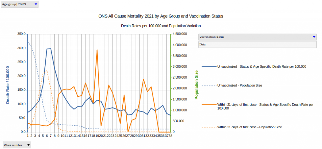
This graphic explains us, that the death rate of the vaccinated follows in very good approximation the group-size changes of the "Within 21 days of the first dose"-group.
If this is puzzling you, then you are not alone.
If we take this result literally, we have to claim that the first dose of vaccine kills the unvaccinated.
The wild peaks up and down in the death rate of the "Within 21 days of the first dose"-group starting around CW 17 are due to the small population size, and must not bother you at all.
If we do not take this result literally, then we need to think about the question: What is wrong with this data?
Three probable explanations for such an effect where given by Norman Fenton, Professor for Risk Information Management, and Martin Neil, Professor for Computer Science and Statistic, both teaching at the Queen Mary University at London, asking: "Is vaccine efficacy a statistical illusion?" 3 :
- A delay in the reporting of deaths could be responsible, leading in a shrinking population to a spike of the death rate, which follows inversely the rate of shrinking. Officially this explanation cannot apply, since ONS claims the data is based on the day of deaths, not on the day of death-reporting.
- The population of the unvaccinated probably got underestimated, which would lead to a growing death rate as the population shrinks.
- Deaths are probably wrongly categorized, meaning vaccinated deaths are attributed to the unvaccinated group.
In the end also other explanations or a combination of explanations might be possible. We don't yet know the explanation, but we know that something is wrong with this data, because we have to believe that unvaccinated are not dying of the vaccination of others. So the data as we see it requires an explanation. To claim its true, that unvaccinated people are dying because others get their vaccine, is an insult on our common sense.
We found an artifact in this data, which shows definitely an effect not existing in real life. As we do not know the cause of that artifact, it seems impossible to remove it reliably. But probably it is, lets take a deeper look.
Death rates only by age group
For further analysis, I installed PostgreSQL 4 and wrote some SQL views. This way its best documented, what the respective view does exactly to produce the graph shown here 5 .
Graph 2
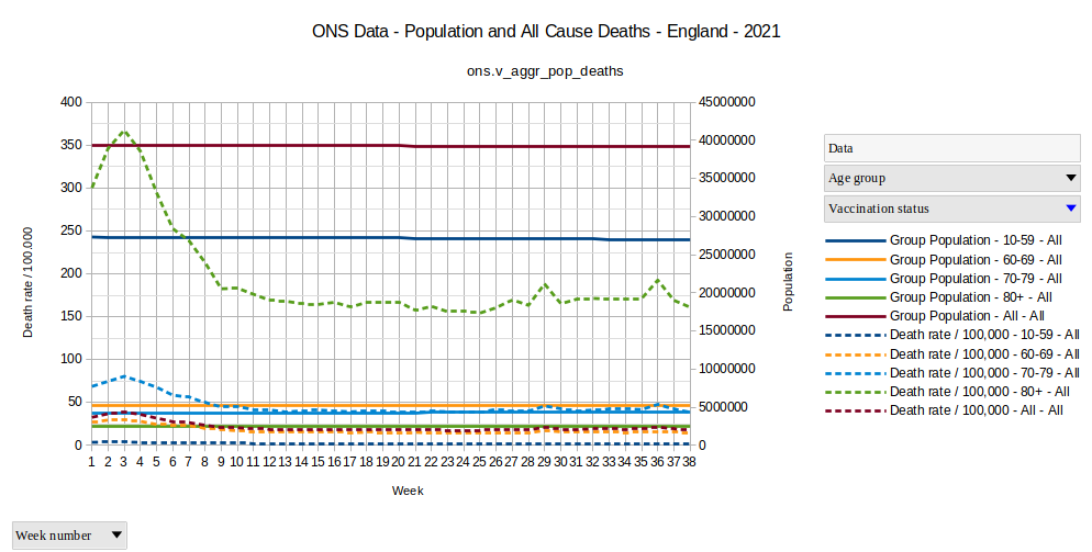
This graph shows us, that nothing special happens with the overall death rates. The highest death rate in all age groups is in CW 3, pointing out that this is not something vaccination related, but simply a seasonal increase as usual in the winter season.
Neither the COVID deaths nor the Vaccination deaths are expected to show up here dominantly and the all cause mortality was in decline where the strange increases in all cause mortality in unvaccinated shows up in the ONS data.
This can be seen as additional indicator, that the strange late death-spike in the unvaccinated group is just a statistic-only-effect without real-life relevance.
Death rate inoculated version unincolated
I'll focus in the further deep dive mainly on the age group 70-79. Less as deep dive but just to have it, I created also a simplified view 6 distinguishing only two vaccination status groups, the group of inoculated people which got at least one shot, and the group of uninoculated people which never got any COVID-shot.
Graph 3
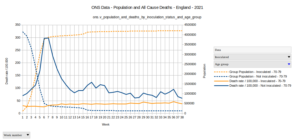
A discussion of the conditions, which could explain such a graph, where the vaccination seems to cause deaths in unvaccinated, was provided by Norman Fenton, Professor for Risc Information Management, and Martin Neil, Professor for Computer Sciences and Statistics, both at the Queen Mary University in London, in their article "Is vaccine efficacy a statistical illusion?" 7 .
My intention is to go further with the investigation.
Checking the population balance
The data from Office for National Statistics is limited to a population, which took part in a Census in 2010 or probably one year next that, plus one additional criteria I forgot about. The point is: it is a closed population, which cam ne left only by death and which is not joined by anyone anytime in 2021.
Because it is a closed group of the population, we can check the changes in the sub-populations with simple math.
E.g. the death rates calculated by ONS use the population number of the week and the deaths of the week to calculate the death rate. Checking some weeks you can easily control that statement. This means, that the population given for the week is always the population at the begin of that week.
If we subtract the deaths of the week from the population of the week, we get the population at the end of the week, which would be the expected population at the begin of the next week.
If we would not have any age groups, this would already be all. But since we have age groups, one can move from one age group to another by having a birthday. But for a start we can ignore this to come back to this point later again. The separation into four different groups by vaccination status is also too complex for a start.
Therefore the next graph shows just for each age group, how much the previous weeks end population differed from the weeks start population. A negative balance (below zero) means, that people join the group by birthday. A positive balance (above zero) means, that people leave the group by birthday. At least that's the only known reason to change the age-group, as deaths take no other part in this balance check than in the calculation of the population at the end of the week 8 .
Graph 4
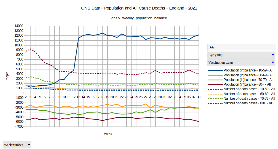
Looks strange? What's going on the age group 10-59 in week 13? An post from Anonymous from December 1st. explains, that the Census was closed on the 27th of March in 2011 9
Therefore my knowledge was weak, until the 27th of March in 2021 new persons (childs) still joined the age group 10-59 by birthday. Now I know better. For the age group 70-79, which I intended to focus on, is anyhow unaffected by this detail.
But it is definitely good to know that I do not have to bother too much because of missing people suddenly appearing where there is no possibility to do so.
We see in this graph that a lot of people leave weekly the group 10-59 to join the group 60-69. In the same time some less move on into the group 70-79, causing a negative balance. The group 80+ cannot be left other than by death, therefore it needs to have a negative balance.
Probably I should switch signs and let a positive balance make grow the group. I could easily do this, as it is just by definition the way it is now. But I stay with the current definition and implementation. It doesn't tell us anyhow, whether the group grows, since deaths are unaccounted for in the balance.
But we can also look at the population balance between the unvaccinated population and the "Within 21 days of the first dose" subgroups in the age group 70-79.
Graph 5
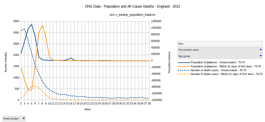
We see until week 4 a very good match, but then the two lines get out of sync. But this is generally correct, since everyone has to leave the second group after the 21 days.
Calculating the balance of the 21 days group
Just by look at the balance shown above, we cannot really tell, whether the 21 days balance fits with the unvaccinated balance. But since the two balances are tightly related, the 21 days balance can be easily calculated from the unvaccinated balance 10
Graph 6
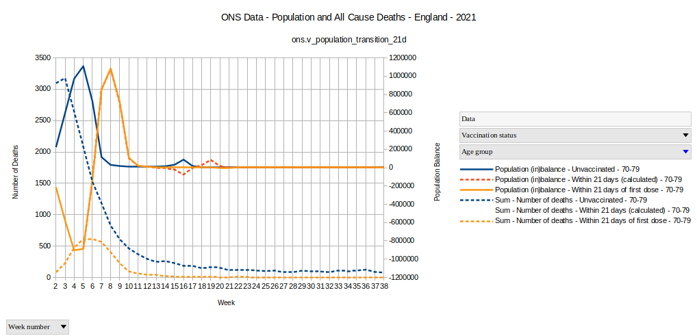
The dotted red line is the calculated balance, based on the transition of people from the unvaccinated group to the 21 days group. The orange line is the line given by the difference between end of last weeks population and begin of new week population as provided by the ONS Data.
The two curves are a very good match, with seemingly tiny mismatches between the 12th and 21st week. Taken literally, a big bunch of unvacinated people where either vaccinated at that time, all dying and not being able to join the 21 days group, or an extraordinary big of people had birthday in these weeks, making the unvaccinated disappear into the next age group.
The event peaks in week 16 and if we look into Graph 4 we do not see any special birthday event with change of age group reflected there for the age group 70-79. And death is also not an alternative, because if their death would have been registered, the peak in the graph would not exist.
We see people dropping out of the unvaccinated group without getting registered in the next group and without being registered as death.
The ledger not in balance. The books are not well kept.
But its not much, isn't it?
Zooming into the deviation in the group transition from vaccinated into the 21 days group
In Graph 4 we see the Net movement between the groups, not directly, but we get an approximation.
- About 12,000 move every week from age group 10-59 into 60-69
- About 9,000 move every week from age group 60-69 into 70-79
- About 5,500 move every week from age group 70-79 into 80+
Sometimes its more or less, but in the time frame we look at its a quite stable situation.
Looking at age group 70-79 we could also say - its a 10 year group, each year having 365 days, every day being as likely a birthday as any other. We can calculate the weekly number of birthdays shifting members above the 79 years as: New 80+ = Population 70-79 * 7 days / 10 years / 365 days/year 11 .
This calculation gives an upper limit for our expectation, in which range a population change of the group can possibly be during one week, without being very suspect. It is a very generous threshold, because:
- It is expected that most vulnerable older people of the group got vaccinated earlier, making birthday events with move to the age-group 80+ in the unvaccinated sub-group less likely than in the overall population.
- The unvaccinated people joining from the next younger age group are not included in this view, and those would narrow down the threshold even more.
At the other hand:
- Including the vaccinated people of this age group leaving into the age group 80+ would increase the threshold, but lets see if these about 5500 weekly age group changing birthdays in this age group would make a difference. If we get that impression, we can extend our SQL statement.
We can apply this view also to subgroups of that age group, which changes its size because of vaccination events.
In the following picture the dotted lines show the upper and lower threshold for the maximal expected birthday related deviation in the weekly population balance based on the size of the unvaccinated group of the age group 70-79.
Graph 7
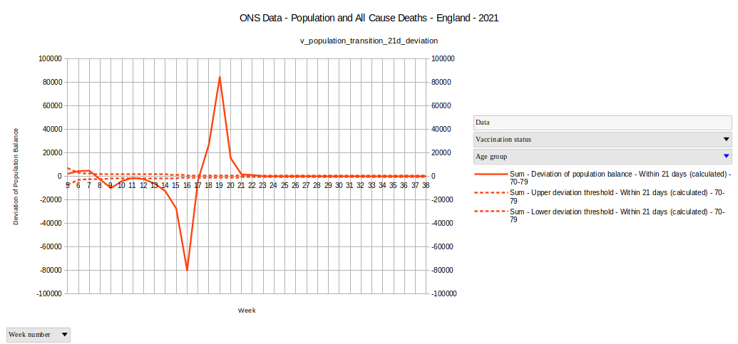
We see a quite strong signal here, way outside the expected birthday related effects. '''In CW 16 the deviation of the population imbalance exceeds the expected birthday related effects by about 80,000 people. '''
What is the exact meaning of this signal?
About 120.000 People left the unvaccinated age group during the weeks 14, 15 and 16 without becoming member of the 21 days group. A possible move into the age group 80+ can not explain this. Looking at Graph 4 we see very clearly, that these 80.000 did not move to the 80+ group during those 3 weeks.
In Graph 3 the group of inoculated people shows a significant increase in week 16 running synchronous with a decrease in the uninoculated people at the same time. This probably means that the major part of these 120,000 people moved into another group. The question remains, in which group did they move?
Searching for the transition target group of 120,000 people
Since the move into age group 80+ definitely can not give any account for these 120,000 people, we have to take a look at other groups inside of the age group 70-79.
Graph 8
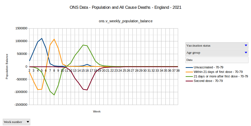
Now that our sight is schooled by the data analysis we did until this point, we can see immediately that at least the major part of these 120,000 unvaccinated people moved directly to the 2nd dose group. Do you see it?
About 120,000 people moved directly from the unvaccintated into the 2nd dose group in the calendar weeks 14, 15 and 16.
You may not ask me, how this is possible. I formulate only a statement made by the "all cause deaths data set" from the Office of National Statistics. It is not my own statement, it is a statement made by the data itself.
One probable reason comes to mind: Maybe they where vaccinated with Janssen / Johnson&Johnson single shot vaccine?
BBC reports at the 28th of May: "Janssen single-dose Covid vaccine approved by UK" 12
This is the end of calendar week 21, which is much later. The single dose vaccination can not provide any explanation.
Aftermath
75,884 all cause deaths where reported in the age group 70-79 in the time frame covered by the ONS data.
If we do not believe, that the vaccinations are responsible for deaths in the unvaccinated group, and if we do not believe that some people get both doses on the same day, which significantly deviates from the official vaccination plan, what is the final conclusion?
About 120,000 unvaccinated suddenly being vaccinated with the second dose, while the complete all cause deaths where less in the same age group.
I can only draw the conclusion, that the complete number of all cause deaths can be covered by the 120,000 people which suddenly jump across two intermediate groups.
And these, I have also to conclude, where the surviving so-called "unvaccinated". I have to name them now "so-called unvaccinated", because they obviously where vaccinated and survived vaccination until the second dose was applied.
No one can tell how many non-surviving so-called "unvaccinted" died before getting the second dose, increasing the officiak death-toll of the unvaccinated group.
Going back to the phenomenon that the death rate of the unvaccinated seemingly follows for its best part the population size of the "Within 21 days" Group, as it is shown in Graph 1. Now that we see about 120,000 "unvaccinated" getting their 2nd dose in the weeks 14, 15 and 16, it is much more than just a guess, that this death rate of the "unvaccinated" is dominated by vaccinated people, which where wrongly accounted as unvaccinated.
120,000+ people aged 70 to 79 did not move into the 'Within 21 days of the first dose' group after getting their first dose.
This tells us also: Every single death rate provided for the "Unvaccinated" aged 70 to 79 in the ONS data deserves to be flagged as 'unreliable'.
Indeed, obviously the same has to be true for all other death rates in the age group 70 to 79.
The Office for National Statics did not deliver on its promise.
Give me a different satisfying conclusion, please.
Going Further?
Since the theme of this statistic, together with the choice for a well-defined closed group, established by itself a kind of double bookkeeping in the data, it was possible to identify a discrepancy in the data proving the bookkeeping as faulty.
Thanks to the nature of a double bookkeeping data set, it might still be possible to correct errors in this bookkeeping to some extend. Probably, if this turns out to work, I'll be able to provide additional insights in a later article.
Cognition is always temporary and always of individual nature. You decide for yourself whether you adapt the findings of others as opinions or whether you acquire own insights. My references are intended to help you with the latter, but you should always use other sources as well.
Do not believe, not even me, but examine and conclude for yourself.
Footnotes
- Deaths by vaccination status, England ; www.ons.gov.uk; Release Date 2021-11-01 ↑
- Professoren stellen die Frage: Ist Impfstoffwirksamkeit eine statistische Illusion? ; Frank Siebert; idee.frank-siebert.de; 2021-12-02 ↑
- Is vaccine efficacy a statistical illusion? ; Norman Fenton, Martin Neil; probabilityandlaw.blogspot.com; 2021-11-14 ↑
- PostgreSQL Installation ; wiki.frank-siebert,de/inst ↑
- View - ons.v_aggr_pop_deaths ;wiki.frank-siebert,de/inst ↑
- View - ons.v population and deaths by inoculation status and age group ; wiki.frank-siebert,de/inst ↑
- Is vaccine efficacy a statistical illusion? ; Norman Fenton, Martin Neil; probabilityandlaw.blogspot.com; 2021-11-14 ↑
- View - ons.v_weekly_population_balance ; wiki.frank-siebert,de/inst ↑
- The impact of misclassifying deaths in evaluating vaccine safety: the same statistical illusion ; Norman Fenton, Martin Neil; Comment by Anonymous, 2021-12-01 ↑
- View - ons.v_population_transition_21d ; wiki.frank-siebert,de/inst ↑
- View - ons.v population transition 21d deviation ; wiki.frank-siebert,de/inst ↑
- Janssen single-dose Covid vaccine approved by UK ; Philippa Roxby; BBC; via archive.org, 2021-05-28 ↑


